01 / The brief
People choosing a lawyer are not shopping. They are worried.
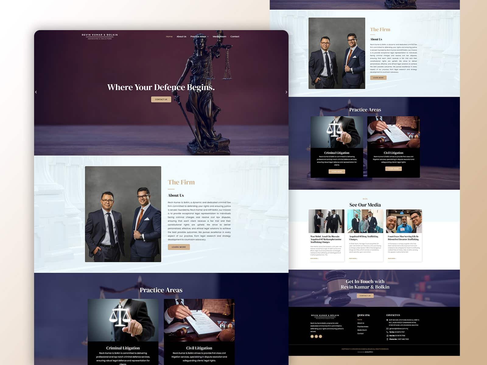
RKB Law needed a site that worked for someone in the middle of a problem: a person who wants to know quickly whether this firm handles their kind of matter, and whether the person handling it is any good.
The existing material was there: practice areas, attorney backgrounds, past matters. It needed a structure that put it in the order a worried reader actually asks for it.
02 / Our approach
Practice area first, then the person, then the proof.
Navigation is organised by the problem the visitor has, not by the firm’s internal departments. From any entry point, the route to the relevant practice area and the attorney who runs it is one step.
The visual language stays deliberately quiet: clean layouts, generous spacing, no stock drama. For legal work, restraint is the credibility signal, and everything that could have looked like salesmanship was removed.
Week 1
Information order
Practice areas and attorney profiles structured around client questions.
Week 1—2
Design and build
Clean layouts, sliders where useful, built against real firm content.
Week 2
Proof and contact
Case studies, testimonials and enquiry routes wired in.
Week 3
SEO and handover
On-page SEO, blog, map, responsive pass and CMS training.
03 / The outcome
A firm that reads as serious on a phone screen.
Thirteen deliverables inside three weeks, responsive from phone to desktop, with attorney profiles and case studies the firm updates itself in WordPress.
Ashiqurtech was cooperative and easy to work with.
RKB Law