01 / The brief
Right-to-left is a layout decision, not a translation setting.
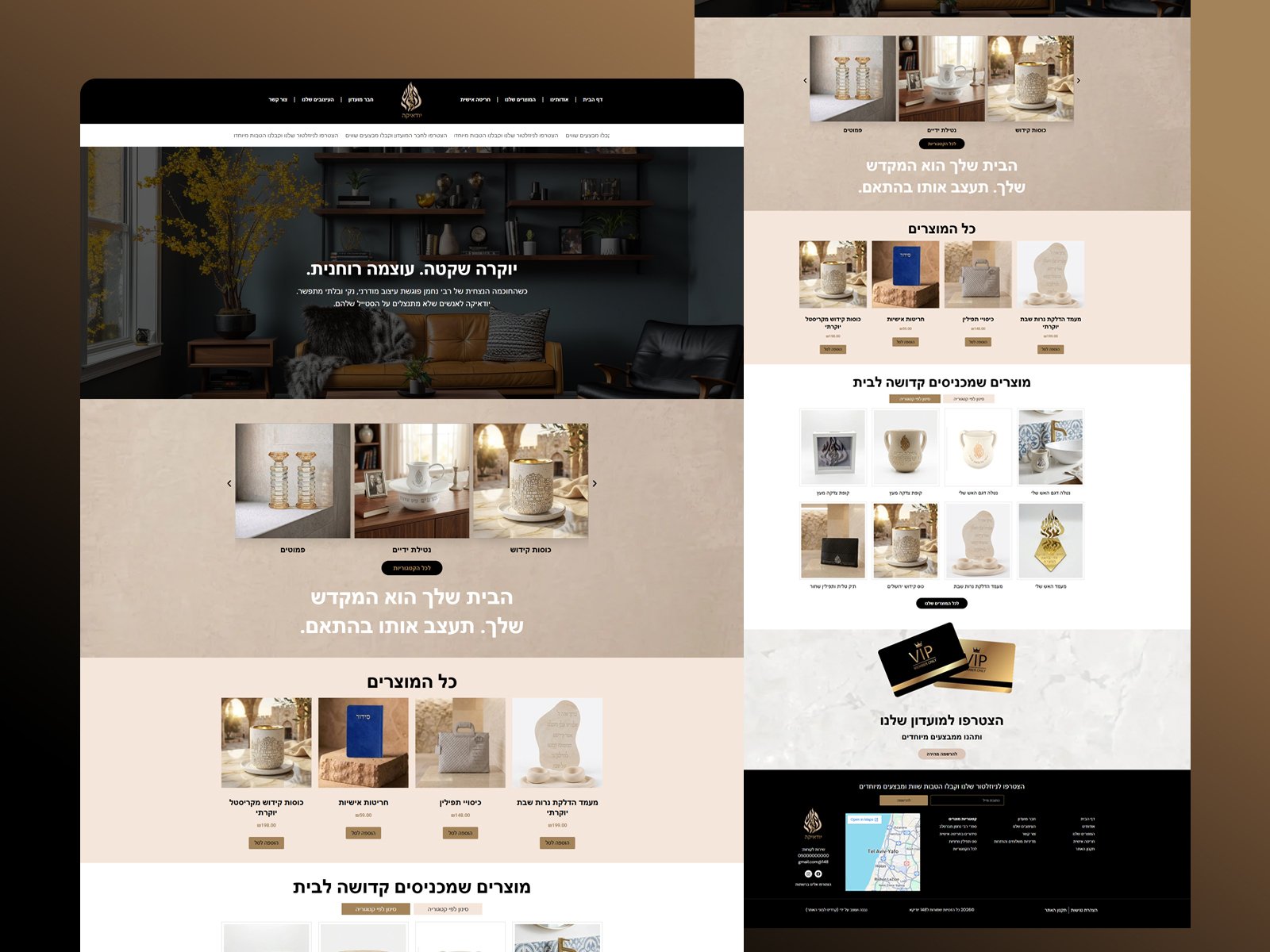
This is a Hebrew-language Judaica storefront selling kiddush cups, candlesticks, washing cups, tallit bags and other ritual objects for the home.
A mirrored English template looks wrong to a Hebrew reader in ways that are hard to name and easy to feel. The layout had to be composed right-to-left from the start.
02 / Our approach
Design the reading order, then merchandise the room.
Navigation, product cards, prices and buttons are all composed for a right-to-left eye path, so the page reads naturally rather than as a flipped import.
Products are photographed and grouped in domestic settings rather than on white, because these objects are bought for a home and the styling is a large part of what is being chosen.
Phase 01
Layout
Right-to-left composition designed from first principles.
Phase 02
Design
Warm stone and gold palette with in-situ product photography.
Phase 03
Prototype
Category, product, membership and locator templates laid out for build.
03 / The outcome
A Hebrew shop that was designed in Hebrew.
A native right-to-left layout, product groups styled in the home, a members’ club, a store location block and a full category structure.