01 / The brief
A supermarket that feels like the neighbourhood shop.
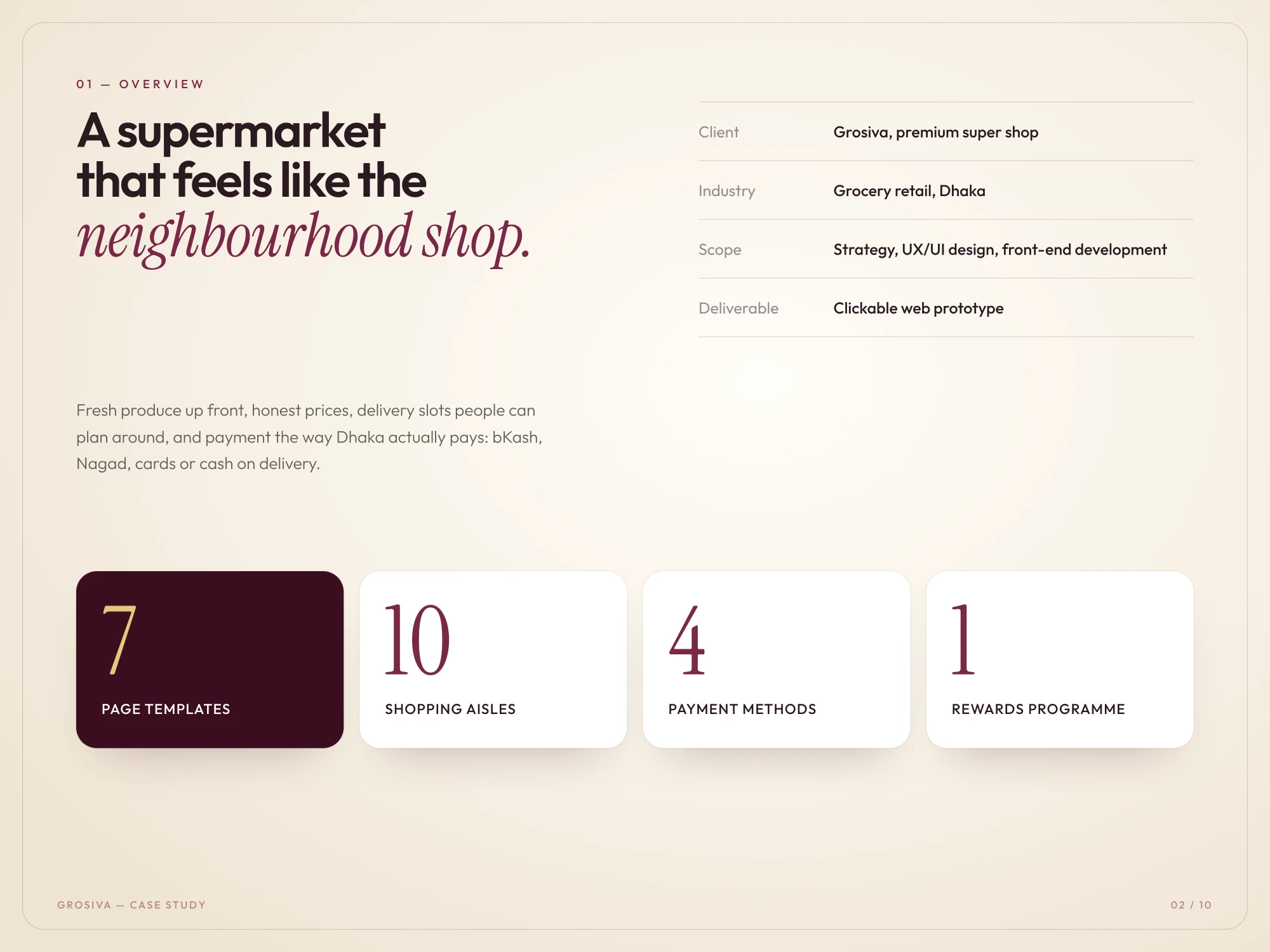
Grosiva is a premium super shop for Dhaka. The brief was a grocery experience with fresh produce up front, honest prices, delivery slots people can plan around, and payment the way Dhaka actually pays: bKash, Nagad, cards or cash on delivery.
We covered strategy, UX/UI design and the full build: a Next.js storefront on a PostgreSQL database, from the first sketch to the working shop. It runs to seven page templates, ten shopping aisles, four payment methods and one rewards programme.
02 / The storefront
A storefront that knows your area.
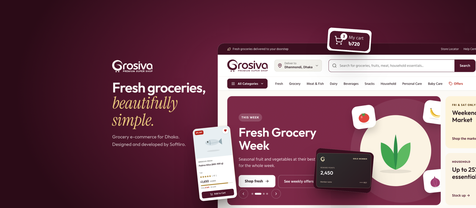
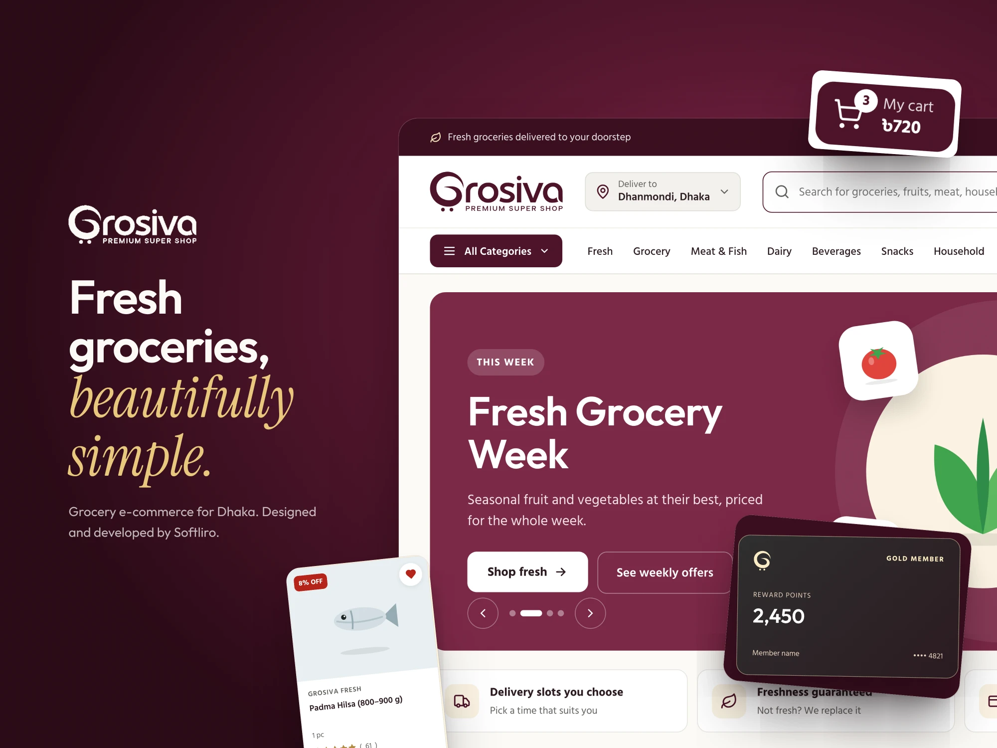
The header opens on where the order is going: a delivery-area picker for Dhanmondi, Dhaka, a wide search for groceries, fruit, meat and household essentials, and the cart total always in view. A weekly banner leads with the season’s produce, and the strip underneath answers the questions shoppers ask first: delivery slots you choose, freshness guaranteed, and the payment methods accepted.
A gold-member rewards card sits beside the banner, so the reason to come back is part of the first screen rather than an afterthought.
03 / Design system
Warm, premium, easy to scan.
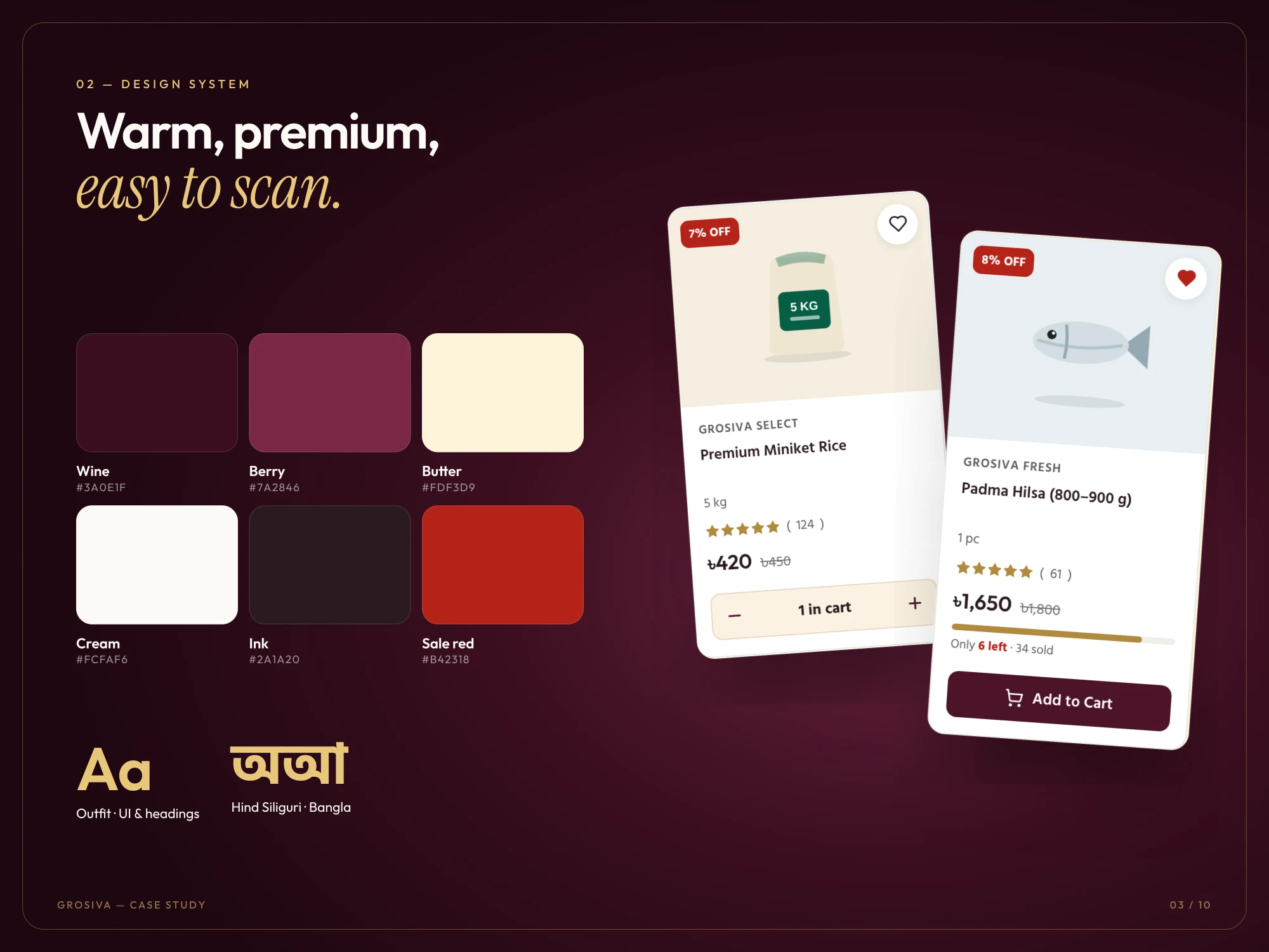
A deep wine and berry palette gives the shop a premium feel, butter and cream keep it warm, and a single sale red is reserved for discounts and low stock so it always means something. Outfit carries the interface and headings; Hind Siliguri sets Bangla alongside it.
Every product card follows the same order: brand, name, pack size, rating, the price with the old price struck through, and one clear Add to Cart. The same card works for a 5 kg bag of rice and a single fish.
04 / Navigation
Every aisle, two clicks deep.
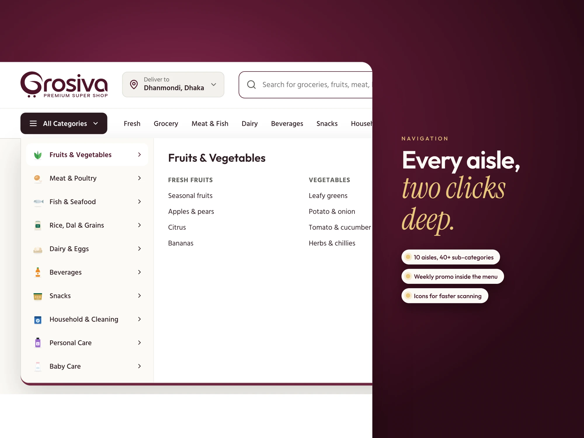
A single All Categories menu opens ten aisles and more than forty sub-categories, with the weekly promotion inside the menu itself. Each aisle has an icon, so people scan by shape before they read.
05 / Shop and filters
Filter fast, find faster.
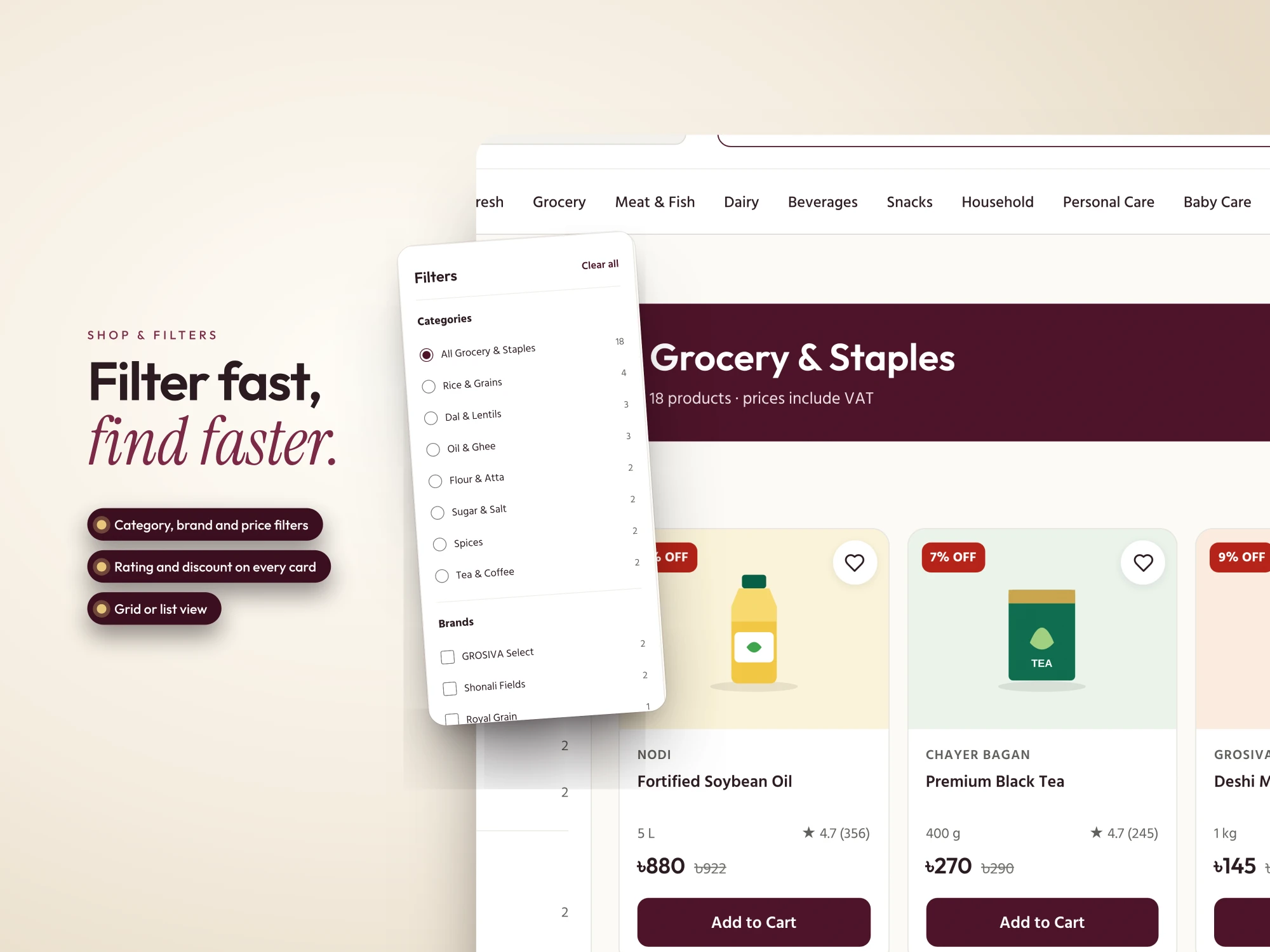
The shop page filters by category, brand and price. Every card shows its rating and discount, and shoppers can switch between a grid and a list depending on whether they are browsing or hunting for one item.
06 / Product page
Pick a size, see the price.
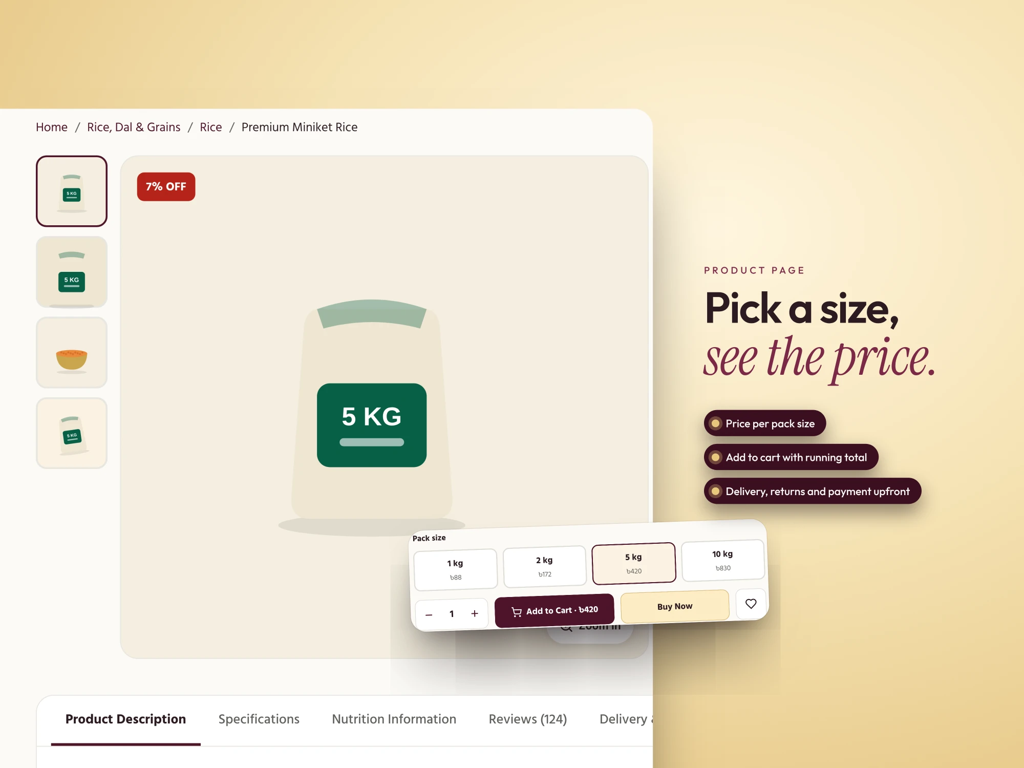
Groceries come in sizes, so the price follows the size: the rice shown here moves from 1 kg to 10 kg without leaving the page, and the Add to Cart button carries the running total. Delivery, returns and payment are stated upfront, before anyone has to ask.
07 / Cart
Clear totals, no surprises.
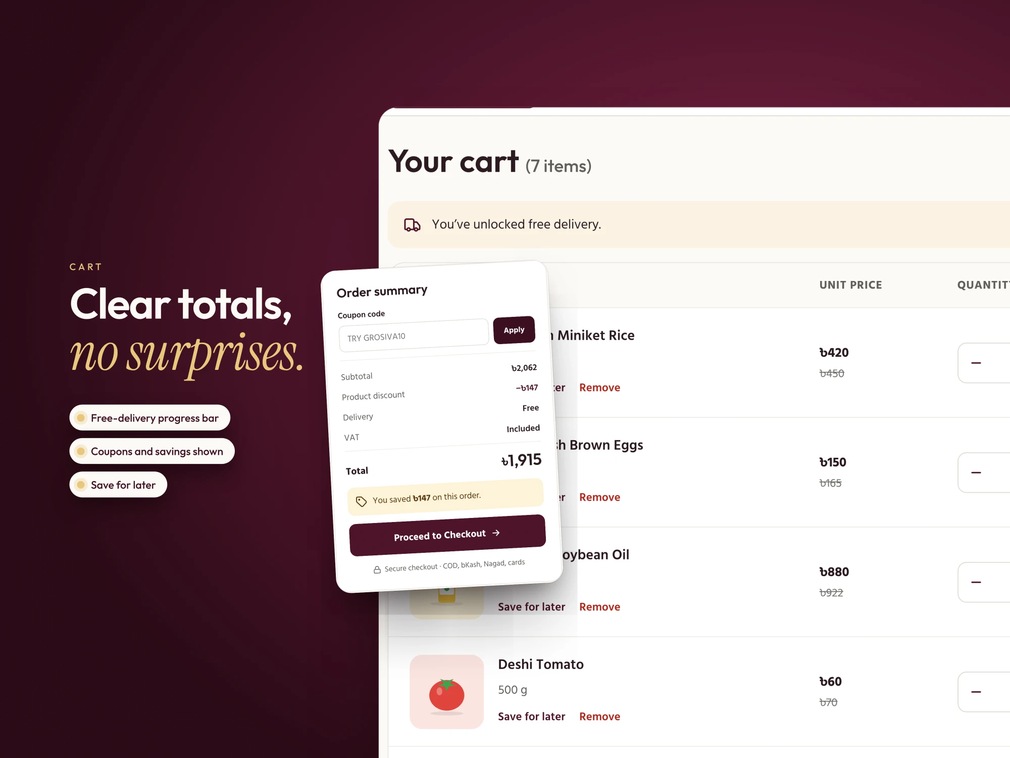
A progress bar shows how close the basket is to free delivery, and tells the shopper when they have unlocked it. Coupons and savings are shown in the order summary, items can be saved for later, and the total lists subtotal, discount, delivery and VAT line by line, with checkout options stated beside the button.
08 / Account and rewards
Reasons to come back.
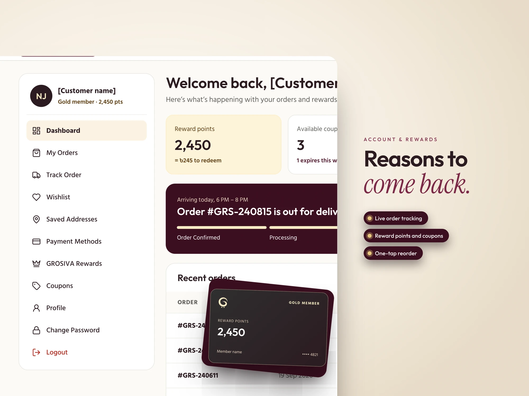
The account area opens on what matters this week: reward points with their taka value (2,450 points is ৳245 to redeem), the coupons available and the one about to expire, and a live banner for the order on its way, with its delivery window and progress.
The sidebar keeps the rest one click away: orders, tracking, wishlist, saved addresses, payment methods, rewards and coupons. Past orders can be reordered in one tap, and the gold-member card gives the rewards programme a face.
09 / The home page
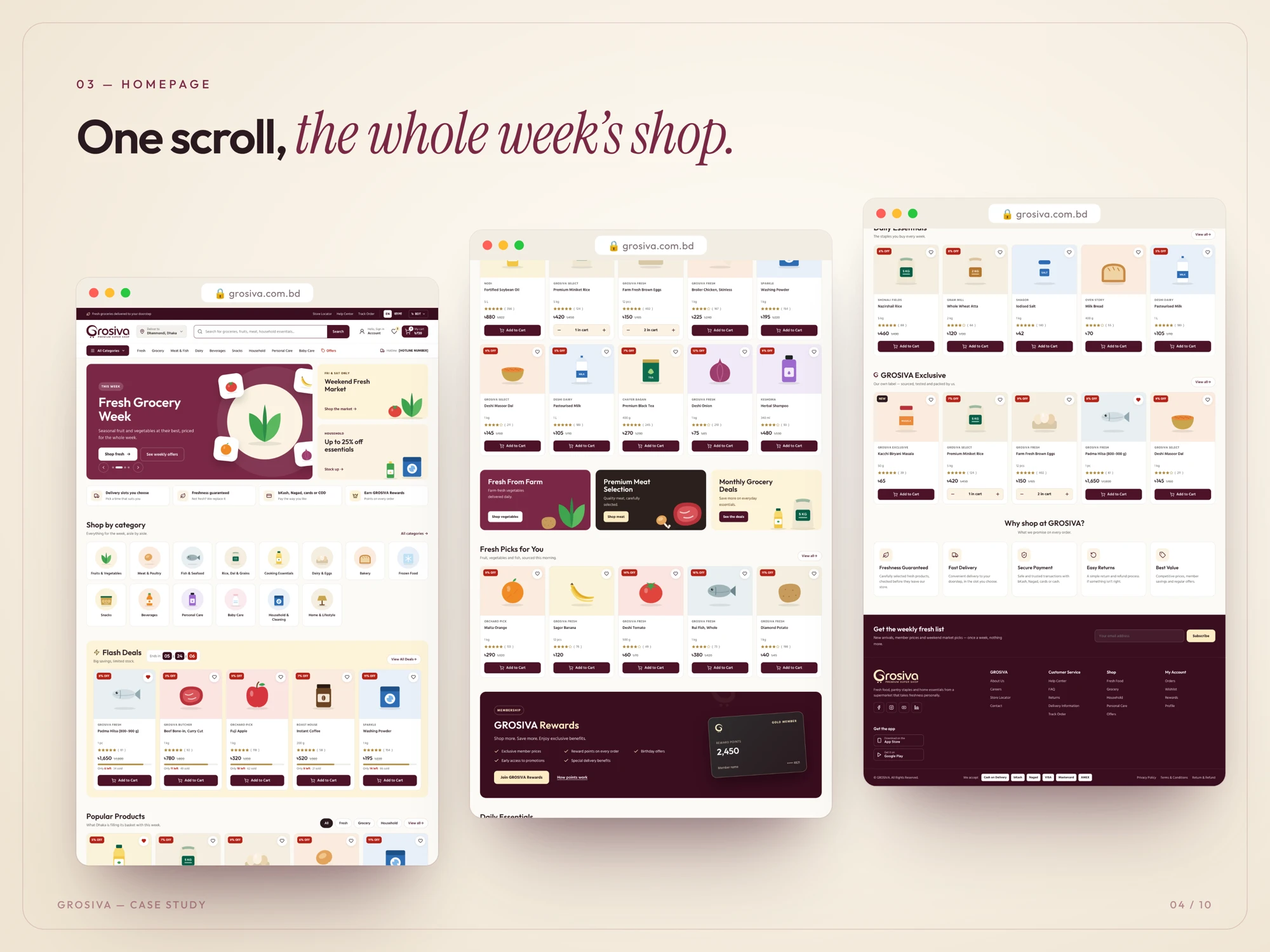
One scroll, the whole week’s shop.
The home page puts the week in order: a seasonal banner first, then the shop-by-category row, flash deals, popular products and fresh picks, with the rewards card and the reasons to shop (fresh guaranteed, secure payment, easy returns) before a weekly-offers sign-up and the footer.
Every block uses the same header, palette and product card as the inner pages, with an English and Bangla switch and prices in taka throughout.
10 / The build
Designed and built as one product.
The same team designed the shop and built it, so nothing was lost between a mock-up and a working page. The storefront is a Next.js application: every page in the design, from the home page and aisles to the product page, cart, checkout and account, is a real route sharing one set of components.
That is what keeps the shop consistent. The header, the product card, the price and the Add to Cart button are each built once and reused, so a change to the card in the design system reaches every aisle at once.
Front end
Next.js
Routes for every template, shared components, and pages that can be rendered ahead of time so aisles and products are quick to open and easy for search engines to read.
Data
PostgreSQL
One relational database for the catalogue, pack sizes and prices, customers, orders, coupons and reward points.
Design system
Shared tokens
The palette, type and card patterns are defined once and used by every page, in English and Bangla.
11 / Catalogue and pricing
Built around how groceries are sold.
A grocery catalogue is not a list of single prices. One product comes in several pack sizes, each with its own price, an optional old price for a discount, a rating and a stock level. PostgreSQL holds that structure directly, so the product page can show every size and the filters can count products by category and brand without guesswork.
Discounts are stored as a price and an old price, and the percentage badge on each card is worked out from them, so a sale is a data change rather than a design change.
12 / Orders, accounts and rewards
From basket to doorstep.
The cart, checkout and account all read from the same order data. The cart totals subtotal, discount, delivery and VAT; checkout collects the delivery details and the payment method (cash on delivery, bKash, Nagad or card); and the account dashboard then shows the order as it moves from confirmed to delivered, with the rewards balance and coupons beside it.
Reward points and coupons live in the database next to the orders that earned them, which is what lets the dashboard show a points balance in taka, the coupons available and the one expiring soon.