01 / The brief
Organic positioning and aggressive discounting pull in opposite directions.
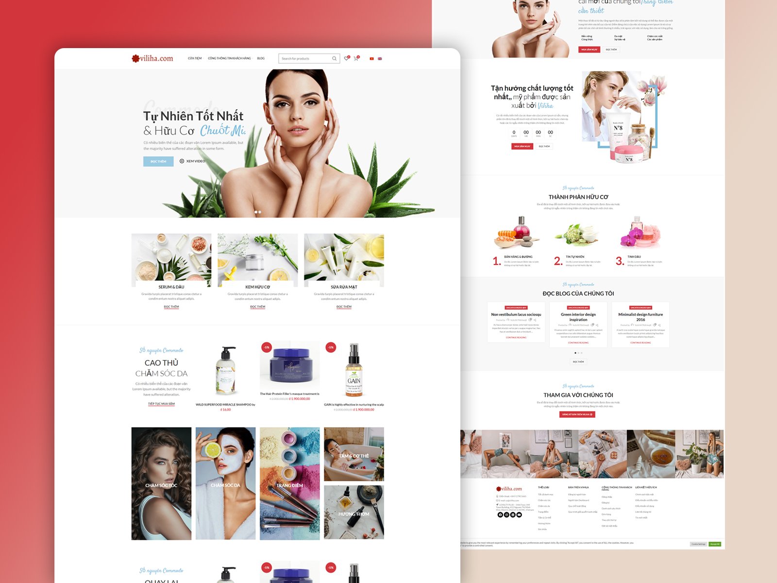
This is an organic skincare and cosmetics storefront selling serums, oils, organic creams and cleansers, with an active promotions programme running alongside the brand story.
Shops in this category usually resolve the tension badly, ending up either too clinical to feel natural or too discounted to feel premium.
02 / Our approach
Editorial above, retail below.
The top of the page is given entirely to the brand (a hero with real photography, a three-tile category introduction and an ingredients section) with no price shown at all.
The discount grid and the countdown offer start only once that argument has been made, so the promotions read as a reason to buy now rather than as the reason the brand exists.
Phase 01
Structure
Brand story and retail grid separated into a deliberate order.
Phase 02
Design
Soft botanical palette with script accents.
Phase 03
Prototype
Category, product and blog templates laid out for build.
03 / The outcome
A shop that earns the price before it discounts it.
A brand-led opening, category and ingredient sections, a promotions grid and a blog, arranged so the discounting never arrives first.